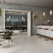
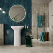
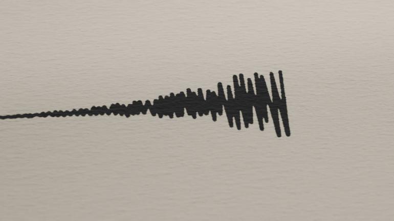
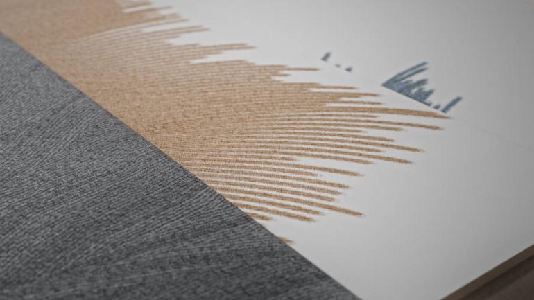
The hand-drawn line shapes the Ink surfaces of Ceramiche Refin
Born from the meeting between artistic gesture and design method, where ceramics take on a symbolic, conceptual and narrative value, the Ink collection of ceramic surfaces by Ceramiche Refin focuses on a free-hand style, instinctive and sincere, born of a train of thought and evolving into a decorative motif generated by micro-sections placed close together, giving rise to a unique and personal style.
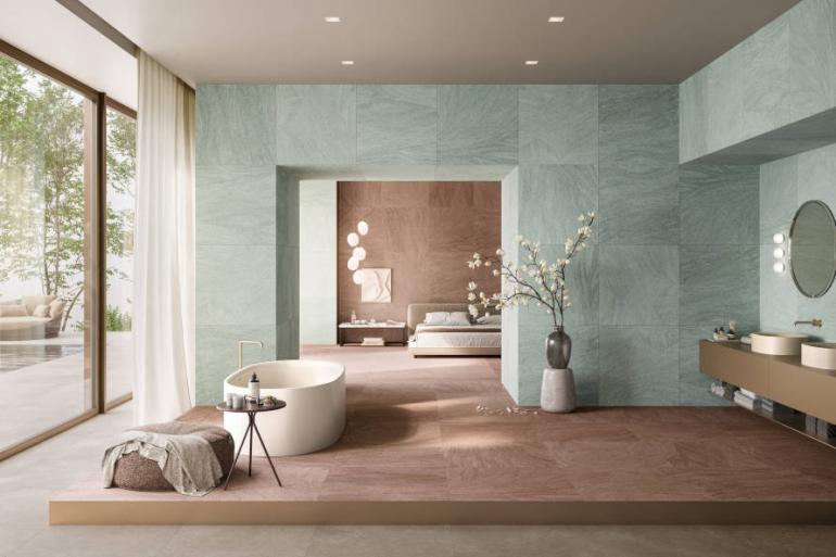
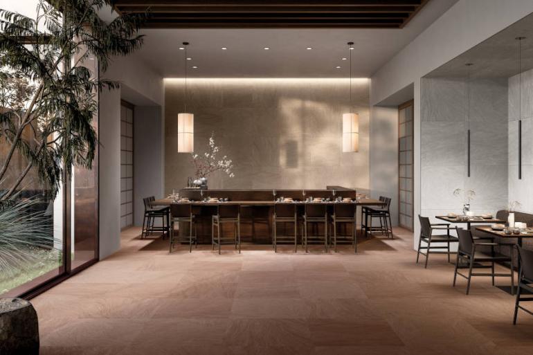
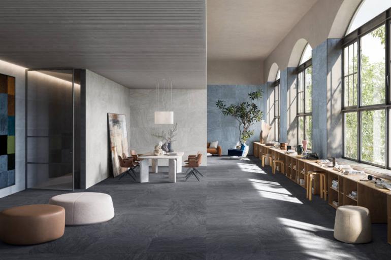
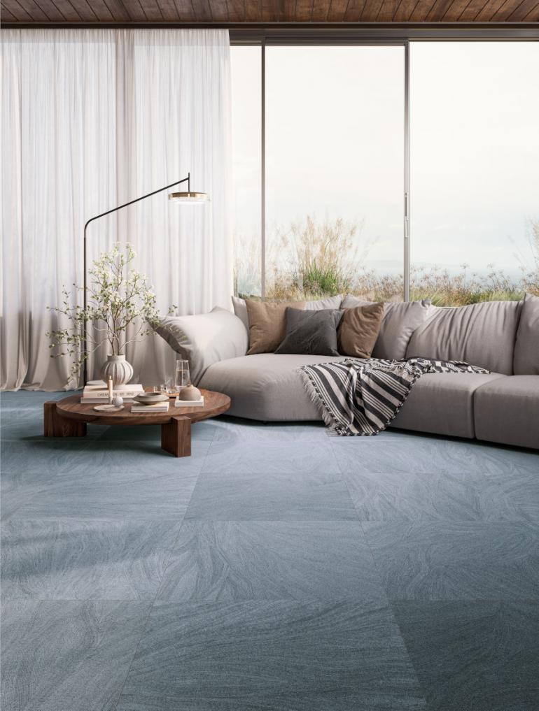
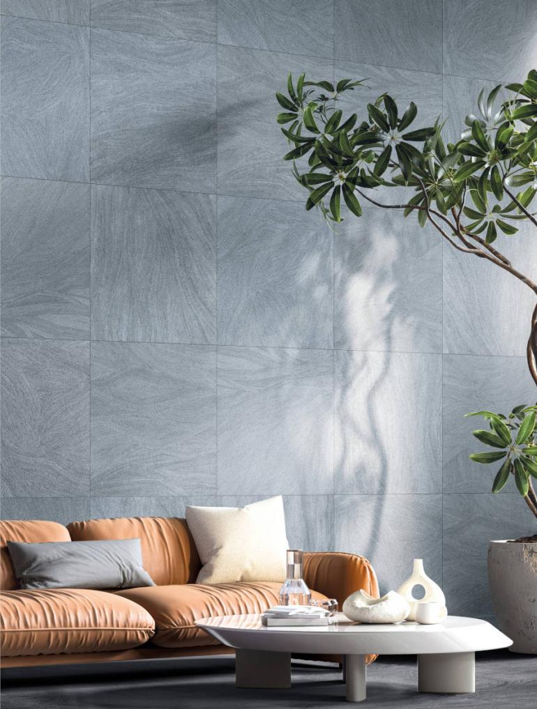
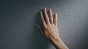
Balanced between minimalism with an Oriental nuance and a strongly graphic design language, the pattern introduces a component of rhythm, detail and movement in its appearance, which appears sober and measured in its entirety. The result is suggestive of the effect of a living pattern, reminiscent of a delicate textile structure, which varies depending on the light and the distance of observation.
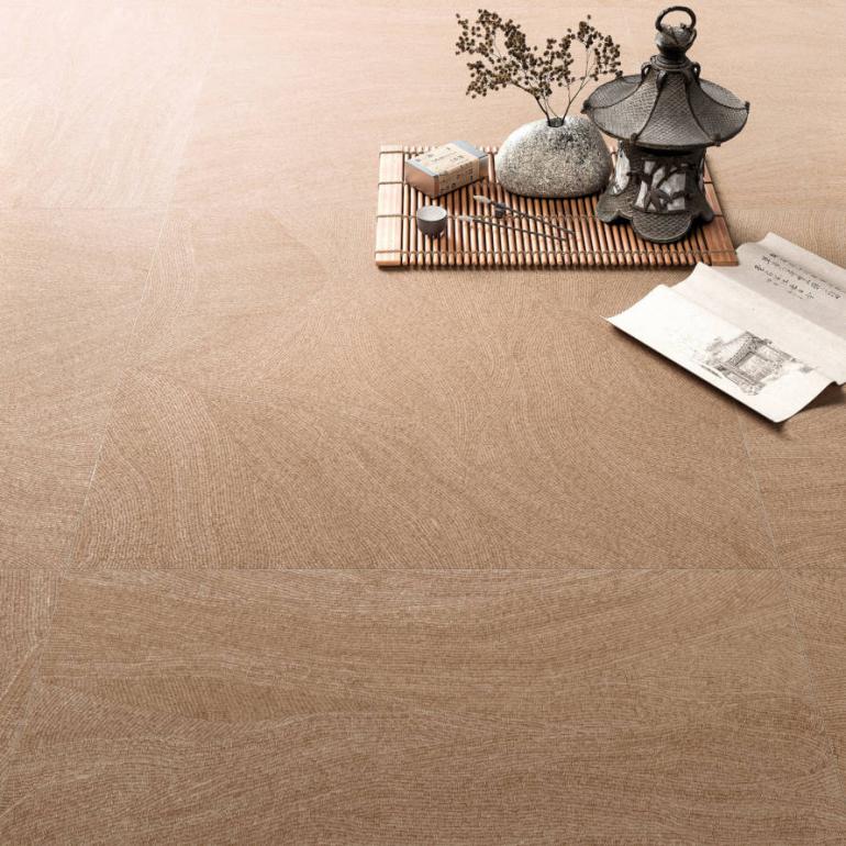
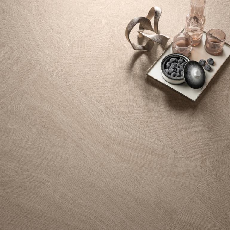
Ink highlights the particular graphic design detail and emphasizes its fluid effect thanks to the 80×80 cm format, creating ever-changing patterns which alter the perception of the surface on the basis of the distance and installation.
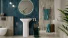
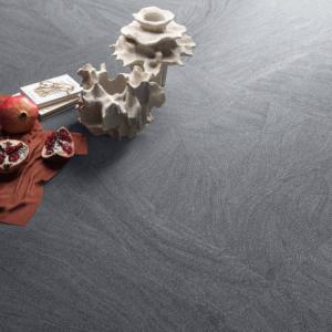
The three neutral shades (white, gray and black), the three warm and saturated shades (earth, powder pink, beige), and the two deep and introspective shades (blue, green) are inspired by moods and form a complete palette which highlights the emotional dimension of the collection. The lustrous texture is multisensory with great tactile depth.
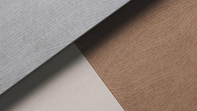
Hand-drawn micro-lines, arranged in variable directions and densities, create an orderly and harmonic pattern which is both vibrant and dynamic, being the result of personal gesturality. The style emerges from a stream of consciousness, creating an authentic expression of the inner reality, translating an intimate and unrepeatable rhythm onto ceramics.
The levels of visual depth change depending on the viewing distance – close, medium or distant – modifying the perception of the pattern, which appears sharper or more compact, revealing the complexity of the composition.
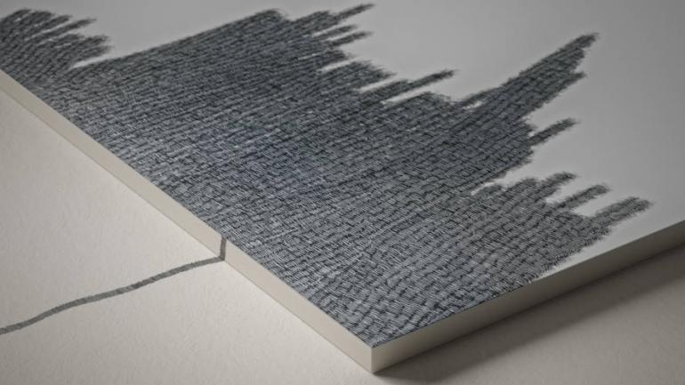
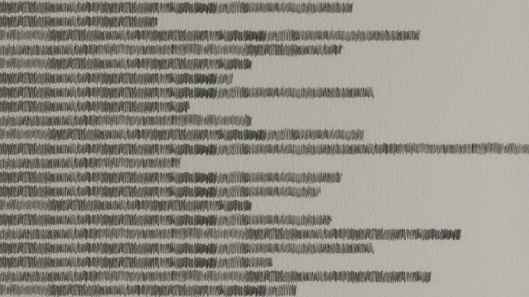
The installation also influences the final effect: by changing the orientation and layout of the tiles, it is possible to create configurations which are always new and surprising.
The palette translates the complexity of the interior world into colors, with multiple conditions of the mind and depths of mood. The Pure white is comfortable and serene; the Grace gray represents elegance and courtesy; the Bold black expresses affirmation, courage and audaciousness; the Cozy beige conveys a relaxing and welcoming approach; the Blush peach color recalls intense and sweet emotions; the Earthy brown recounts an intimate connection with nature; the Quiet green creates a combined image of peace and calm; the Wavy blue describes the wave-like motion which animates the deepest thoughts.
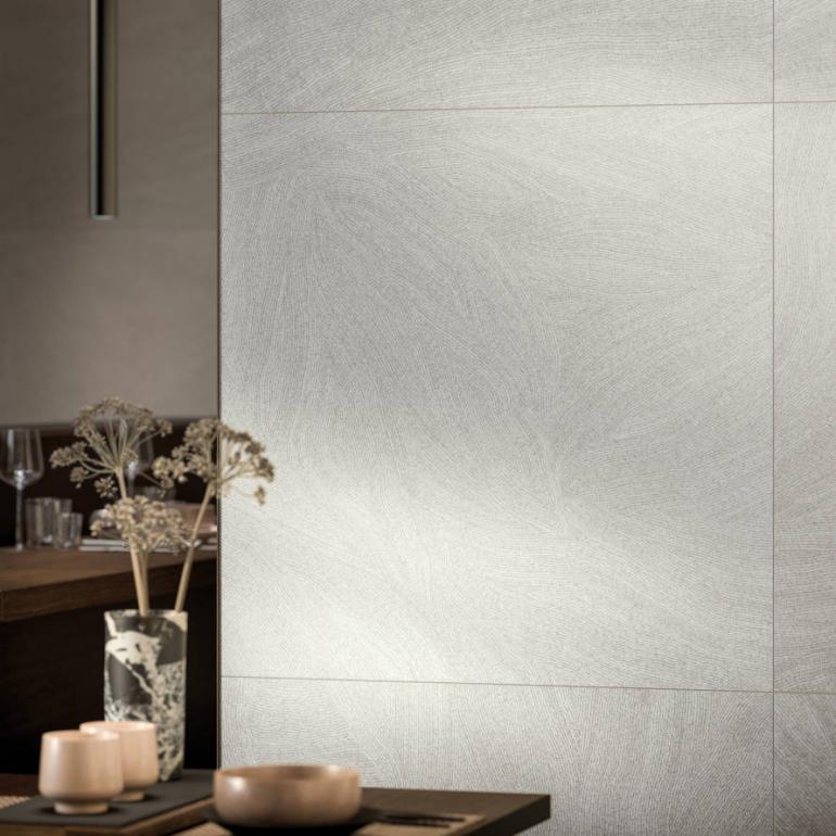
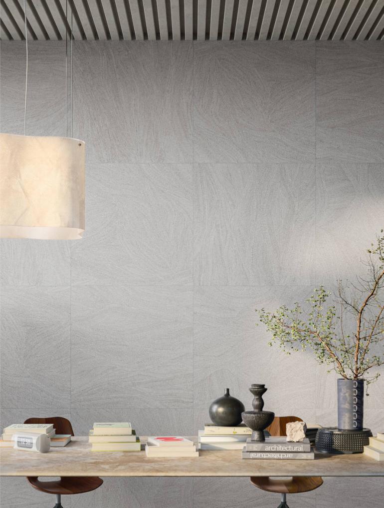
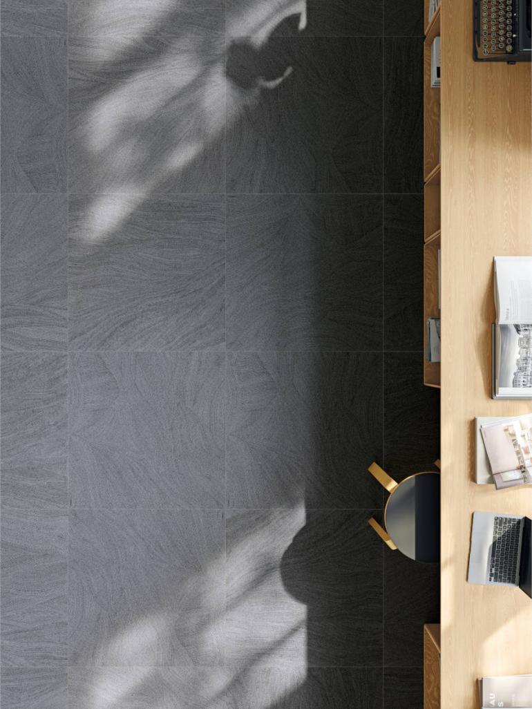
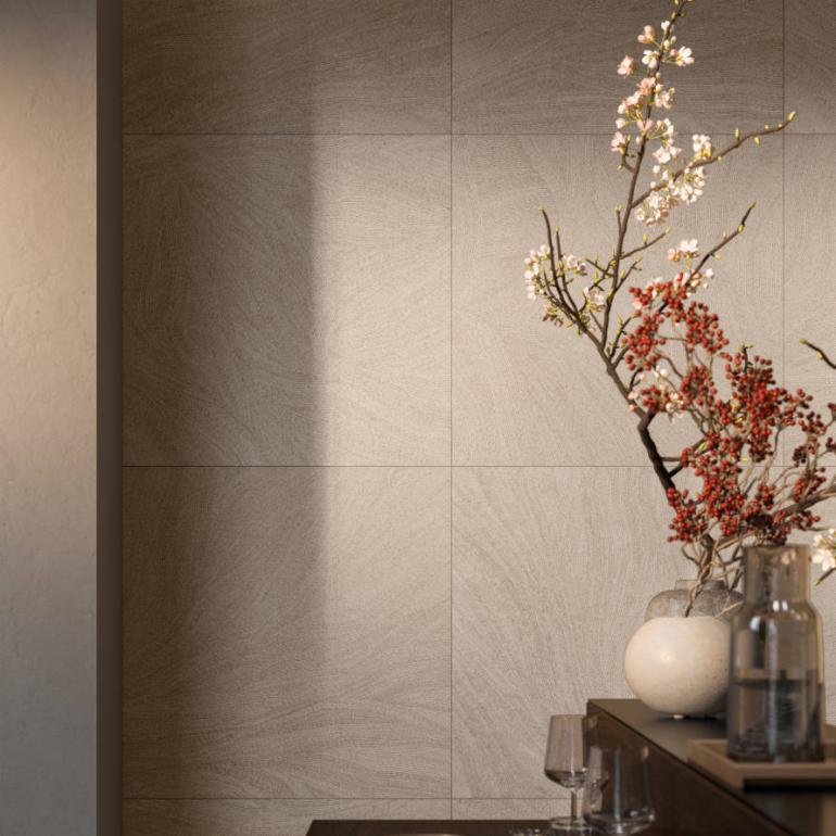
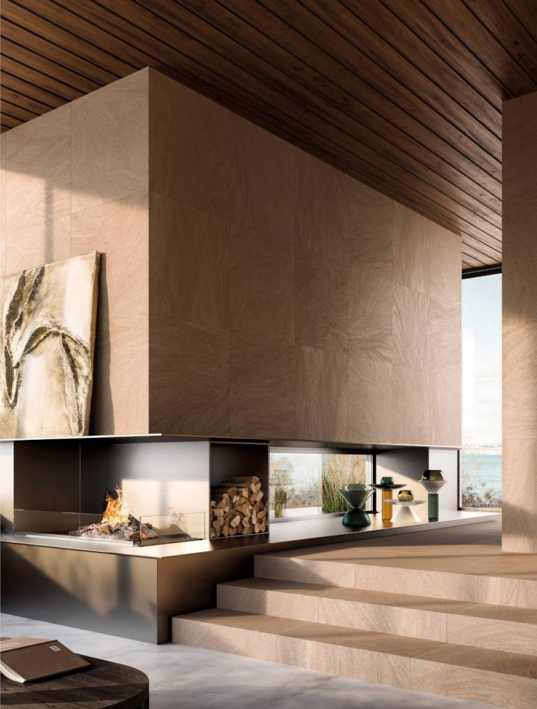
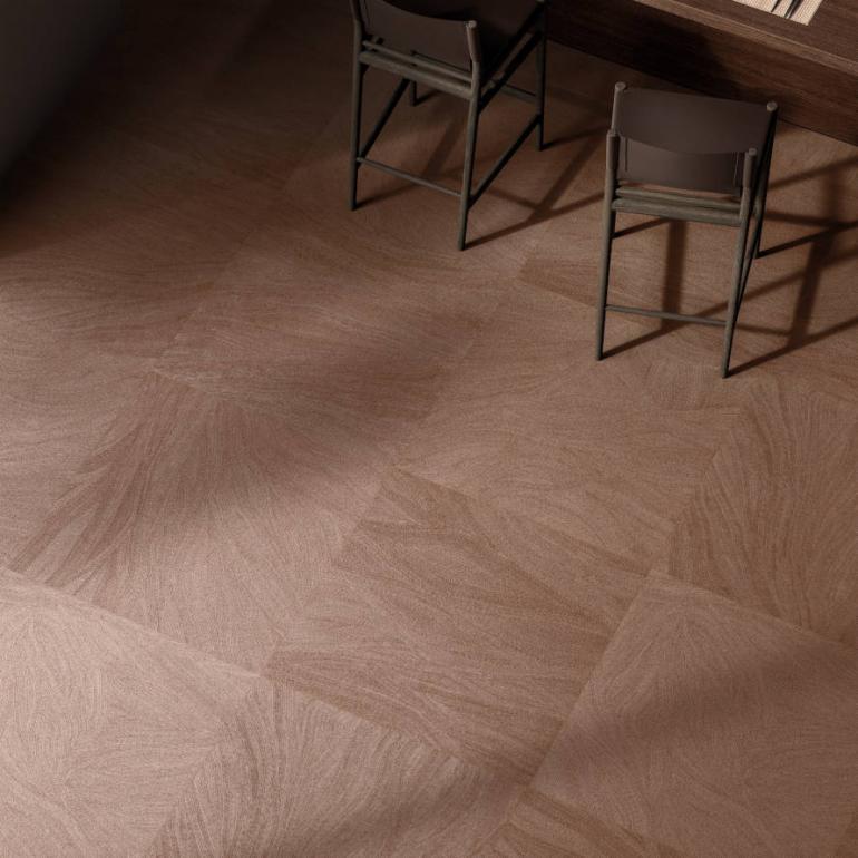
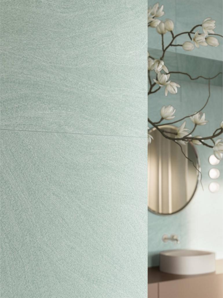
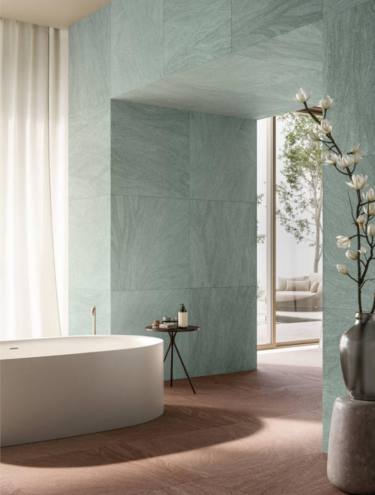
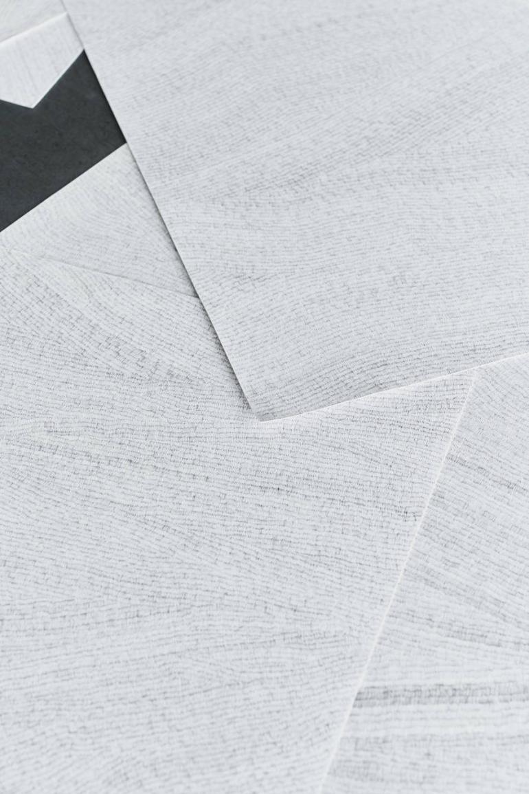
Photo credits: Ceramiche Refin